Different Measurements Show Different Views of State Poverty
The nation received good news from the U.S. Census Bureau reported last week, that real median household income increased by 5.2 percent between 2014 and 2015, while the official poverty rate decreased 1.2 percentage points. At the same time, the percentage of people without health insurance coverage decreased. There has already been reporting on how the metrics pointing to prosperity haven’t touched all income groups. MuniNet looks at state poverty levels, the discrepancies across states, and different Census measurements of poverty.
MEASUREMENT METHODS
There are multiple ways the Census Bureau measures poverty. Traditionally, national income figures are published in the report Income, Poverty, and Health Insurance Coverage in the U.S. Facts and figures for states and metropolitan areas are commonly reported in annual American Community Survey.
While the American Community Survey is extensive, it reports the poverty number only for a single year, giving a snapshot in time. The Income, Poverty, and Health Insurance Coverage in the U.S. publishes a second report, the Supplemental Poverty Measure, which looks at poverty using a three-year rolling average for states. The Supplemental Poverty Measure is also a different form of measurement from the Official Measure.
According to the Census Bureau, they coupled with the Bureau of Labor Statistics to develop another measure of economic well-being, including how Federal policies affect those living in poverty. How each measurement determines units of measurement, poverty threshold, adjustments and changes to the threshold, and the measure of unit resources is detailed in the table below, provided by the U.S. Census Bureau. As one can see, the SPM considers a more nuanced look at who may be living in a household, as well as what types of expenditures (medical, work, utilities, etc.) ought to be considered ‘necessities’. Both measures account for family size and composition (teenagers eat more than toddlers) but only the SPM accounts for geographic differences in housing costs (San Francisco is more expensive than Topeka). The SPM takes into account not only the Federal benefits that households can receive, but also tax payments/credits, when determine available resources.
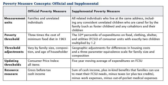
Source: U.S. Census Bureau
The Official Measurement has been in place and remained largely unchanged since 1969. It measures before-tax cash income, giving a broad look at poverty within the market economy. It remains very valuable in giving a look at poverty rates over time, and if one wants to look at how the economy is affecting poverty rates prior to government safety net policies.
STATE MEASUREMENTS
Below are the ten states with the lowest state poverty rates and highest state poverty rates, using the Official Measure of the three-year average ending 2015. We have also included the Supplemental Poverty Measure for each state, and calculated the difference between the two. The ‘Number’ is the actual number of individuals below the poverty line, listed in thousands of persons (000s).
We have also calculated the difference between the the Official Measurement and the SPM for each of the states in the two charts below. It is important to note the difference in the two figures, as it in large part reflects how housing costs, Federal benefits, and Federal tax burdens impact poverty in a given state, and how they have different impacts across states. Given that the poverty threshold for the SPM includes work expenses and medical costs, the variances in these expenses across states may be greater. For example, a state with a higher urban population, where many workers may have to commute to and from work every day, could have higher per capita work-related transportation costs. Such costs, along with the higher housing costs that are typically found in urban environments, would have an upward effect on the poverty rate under the SPM. Conversely, a state with comparatively low housing costs, or a comparatively high percentage of households receiving Federal assistance, could see their poverty rate under the SPM be lower than that of the Official Measure.
Three of the four states with the lowest poverty rates are in New England, including New Hampshire, which has the lowest Official poverty rate of only 6.7%. A southern cluster of four conjoined states, Louisiana, Mississippi, Alabama, and Georgia are all within the ten states with the highest poverty rates by this measure. New Mexico has the highest rate of 22%.
TEN STATES WITH LOWEST POVERTY RATES* – 2015

*Number refers to number of individuals in poverty, in thousands of persons (000s). Data source: U.S. Census Bureau
TEN STATES WITH HIGHEST POVERTY RATES* – 2015
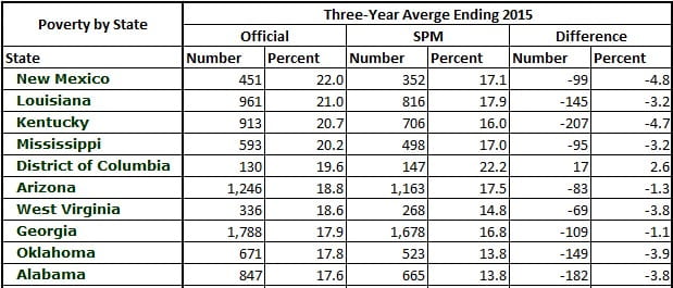
*Number refers to number of individuals in poverty, in thousands of persons (000s). Data source: U.S. Census Bureau
How do the different measurements affect the state poverty rates? As we show below, the difference can be dramatic. We’ve listed the five states with the largest discrepancies between the Official Measurement and the SPM. This includes states whose SPM is larger or smaller than the Official Measurement. As you can see, Hawaii has a 16.8% poverty rate as of 2015, while the Official Measurement calculates its poverty rate at 10.9%, a difference of 5.9%. There does not appear to be any geographic clustering of large measurement discrepancies. California and Hawaii are well known for their high housing costs, so it is not very surprising to see them having significantly higher poverty rates under the SPM. The reasons for New Mexico and Kentucky having significantly lower poverty rates under the SPM are less clear.
STATES WITH FIVE LARGEST DISCREPANCIES BETWEEN POVERTY MEASUREMENTS – 2015
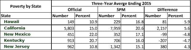
*Number refers to number of individuals in poverty, in thousands of persons (000s). Data source: U.S. Census Bureau
The Census Bureau first started publishing the Supplemental Poverty Measure in 2011. We thought it would be worth taking a look at the difference in the SPM state poverty levels between 2011 and 2015, to give a look at how states have performed from two years after the official end of the Great Recession to four years after that. Below is a list of all fifty states plus D.C., sorted by the final column, showing the difference in the SPM rate from 2011-2015. Colorado was the top performer, lowering its poverty rate by 3.1% between 2011 and 2015. The top five states that most reduced their poverty rate are interestingly all in the western half of the country.
CHANGE IN POVERTY RATE OF 50 STATES PLUS D.C. BY SUPPLEMENTAL POVERTY MEASURE – 2011-2015
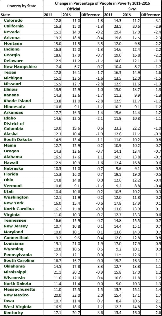
*Number refers to number of individuals in poverty, in thousands of persons (000s). Data source: U.S. Census Bureau
Continuing to track the Official Measurement is useful in looking only at cash income and as a means of measuring a consistent number over time. However, the Supplemental Poverty Measure gives a different perspective that is probably more illustrative of the actual well-being of American families.
by Jeffrey L Garceau